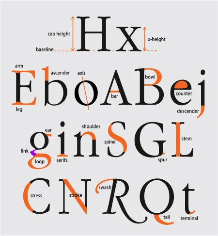
apex: the top point of a letterform where two angled strokes meet
arm: a secondary stroke that extends horizontally or diagonally from a stroke at the top and does not connect to another stroke
ascender: the part of a lowercase letter that extends above the x-height
barb: the terminal for a curved capital serif letter
baseline: the horizon on which letters sit
beak: the terminal for a straight capital serif letter found on the horizontal strokes
body copy: the text that makes up a paragraph—it reads best when set between 8 and 11 points in size
bowl: a curved stroke that connects to either a vertical stroke or to itself
bracket: a piece that connects a stroke to a serif
closure: the principle that states the eye will complete a path of an object
compound modules: formed by combining modules horizontally, vertically or both
continuity: once the eye begins to follow something it will continue traveling in that direction until it encounters another object
counter: any enclosed space in a letterform. If the space is completely enclosed, it is referred to as a closed counter. An open counter occurs when a curved, straight or angled stroke does not connect to another stroke but still creates an enclosed space.
cross bar: a stroke that horizontally connects two strokes
cross stroke: a stroke that crosses over another stroke but doesn’t connect on either side
crotch: inside of a vertex
descender: the part of a lowercase letter that extends below the baseline
drop cap: a larger letter at the beginning of a paragraph that drops down into the lines of text below it
ear: the small extension that protrudes up and out from the top of a stroke or bowl and is often teardrop-shaped or rounded
em dash: a long dash that indicates either a change of thought or emphasis
en dash: a medium-length dash indicating a range of items or the passage of time
eye: the closed counter of a lowercase e
font family: all the variations in weight, width and angle of a typeface
graphic text: text formatted to output as an image file
grid: a matrix of vertical and horizontal lines that come together to create a two-dimensional structure
hanging cap: a letter at the beginning of a paragraph that literally hangs outside the edge of the paragraph
headline: line of text that stands out from the rest of the page and sets the tone for the document, generally set at 18–24 points or larger in size
hyphen: a short dash used for words that break at the end of a sentence and for compound words
hyphenation: the splitting of a word at the end of a line and continuing onto the next line
indent: a small space before the first word of a paragraph equal to an em space, the space occupied by a capital M
inherent web text: text programmed to automatically resize to match the resolution and viewer’s browser preferences
italic: angled version of letterforms that are redrawn, but the letters remain consistent with the essence of the overall look
kerning: a manual adjustment of the space between two letters
leading: horizontal white space between lines of text
leg: a secondary stroke that extends horizontally or diagonally from the bottom of a letter
legibility: the ability to discern all parts of a character and all the styles within a font family
ligature: two or more letters that touch
lining numbers: numbers that line up along the cap height
link: the small piece which connects the upper bowl with the lower loop of a traditionally shaped lowercase g, also known as two-story g
live text: searchable and editable text
loop: the lower bowl of a traditionally shaped lowercase g, also known as two-story g
monogram: a design that contains overlapping letters, usually the first, middle and last initials of a person’s name
oblique: angling letterforms with little or no change to the letterfoms
old style numbers: numbers that have varying heights with ascenders and descenders when set along the baseline
optical alignment: aligning letters that are curved or pointed above the cap height, below the baseline or outside vertical alignment to allow them to align optically
point: measuring system used for type size—there are 72 points in an inch
prime marks: symbols that denote inch and feet, also known as dumb quotes
readability: the level of a word’s comprehension based upon font choice, size, style, kerning, tracking, case and location on the page
sans serif: typeface with no extra structural extensions coming from the horizontal and vertical strokes.Sans is a French word meaning “without”—hence the phrase sans serif means “without serif”
serif: small structural extensions that are at the end of a letter’s horizontal and vertical strokes. Serifs come in a variety of shapes and sizes. Serif also refers to the category name of a font that has serif extensions.
shoulder: a short rounded stroke that connects two vertical strokes or a vertical stroke and a terminal
smart quotes: quotation marks that curl or angle toward the text, also called curly quotes
spine: the curved stroke through the middle of an s
spur: a small pointed extension typically coming off the top or bottom of a vertical stroke that connects to a rounded stroke—oftentimes on a serif lowercase letter
standup cap: a letter at the beginning of a paragraph that is several times larger than that of the surrounding text but shares the same baseline as the body copy
stress: the axis created by the thick and thin stroke contrast of a letter
stroke: a straight or curved line that creates the principal part of a letter
subhead: brief line of text that divides the body copy into sections between headlines and body copy
swash: the extra flourish that accompanies many script and blackletter style typefaces
tail: the stroke that crosses the lower half of an uppercase Q
terminal: a stroke ending without a serif
tracking: the spacing between all of the letters in a word or sentence
vertex: the bottom point of a letterform where two angled strokes meet
weight: varying degrees of thickness built into a font with a standard range being light, roman (also called book), medium, bold, heavy and black
whispering headline: a headline that fails to attract the attention of the viewer because it is too small, blends in with the text to which it is assigned or is of insufficient boldness or color contrast
x-height: the center area of the baseline and cap height, measured against the height of the lowercase x
1. Bling (n): Expensive, ostentatious clothing and jewelry.
2. Bromance (n): A close but non-sexual relationship between two men.
3. Chillax (v): Calm down and relax.
4. Crunk (adj): Very excited or full of energy.
5. D’oh (ex): Exclamation used to comment on a foolish or stupid action, especially one’s own.
6. Droolworthy (adj): Extremely attractive or desirable.
7. Frankenfood (n): Genetically modified food.
8. Grrrl (n): A young woman regarded as independent and strong or aggressive, especially in her attitude to men or in her sexuality (A blend of “Grrrr” and “Girl.”)
9. Guyliner (n): Eyeliner that is worn by men.
10. Hater (n): A person who greatly dislikes a specified person or thing.
11. Illiterati (n): People who are not well educated or well informed about a particular subject or sphere of activity.
12. Infomania (n): The compulsive desire to check or accumulate news and information, typically via mobile phone or computer.
13. Jeggings (n): Tight-fitting stretch trousers for women, styled to resemble a pair of denim jeans.
14. La-la Land (n): A fanciful state or dream world. Also, Los Angeles.
15. Locavore (n): A person whose diet consists only or principally of locally grown or produced food.
16. Mankini (n): A brief one-piece bathing garment for men, with a T-back.
17. Mini-Me (n): A person closely resembling a smaller or younger version of another.
18. Muffin Top (n): A roll of fat visible above the top of a pair of women’s tight-fitting low-waisted trousers.
19. Muggle (n): A person who is not conversant with a particular activity or skill.
20. Noob (n): A person who is inexperienced in a particular sphere or activity, especially computing or the use of the Internet.
21. Obvs (adv): Obviously.
22. OMG (ex): Used to express surprise, excitement, or disbelief. (Dates back to 1917.)
23. Po-po (n): The police.
24. Purple State (n): A US state where the Democratic and Republican parties have similar levels of support among voters.
25. Screenager (n): A person in their teens or twenties who has an aptitude for computers and the Internet.
26. Sexting (n): The sending of sexually explicit photographs or messages via mobile phone.
27. Textspeak (n): Language regarded as characteristic of text messages, consisting of abbreviations, acronyms, initials, emoticons. (wut hpns win u write lyk dis.)
28. Totes (adv): Totally.
29. Truthiness (n): the quality of seeming or being felt to be true, even if not necessarily true.
30. Twitterati (n): Keen or frequent users of the social networking site Twitter.
31. Unfriend (v): Remove (someone) from a list of friends or contacts on a social networking site.
32. Upcycle (v): Reuse (discarded objects or material) in such a way as to create a product of higher quality or value than the original.
33. Whatevs (ex, adv): Whatever.
34. Whovian (n): A fan of the British science-fiction television series Doctor Who.
35. Woot (ex): (Especially in electronic communication) Used to express elation, enthusiasm, or triumph.
We can help transform your words, art, and ideas into high-quality, perfect-bound paperbacks, ready to be proudly displayed on shelves, to make the perfect gifts, or -- who knows? -- to take the literary world by storm.
Let us guide you and your book through the entire printing process. We want your books to be as wonderful as they possibly can be. Pricing starting as low as at $100! Contact us today to find out more!
We all know people like them, people who seem to know everyone. They're always able to help -- or if they can't, they know someone who can. You meet them for the first time and in 15 minutes, you're talking with them like you're childhood friends. They're successful, smart and funny, with a likable touch of self-deprecation. And they're interested in everything.http://bit.ly/yniFnh
Language evolves. Today the AP style changed from e-mail to email, no hyphen.
Thought of the day...
When it comes to logo design and brand identity, it's best to leave trends to the fashion industry. Trends come and go like the wind and the last thing you want to do is invest a significant . Click here to read more before purchasing this must-have book.